Walking down memory lane with nostalgia marketing
Nostalgia is a powerful emotion that can transport us back to a time when life seemed simpler and happier. It is a longing for the past that can evoke fond memories of childhood, family, and friends.
Nostalgia marketing is a marketing technique that aims to evoke positive memories and emotions from the past in order to build an emotional connection between the brand and the consumer. The goal is to tap into consumers' sentimental feelings about the past, often through the use of imagery, sounds, or other sensory cues, and use those feelings to create a sense of brand loyalty and identity.
In recent years, nostalgia marketing has become an increasingly popular trend among brands, with many companies leveraging nostalgia to create engaging and memorable advertising campaigns.
The main benefit of nostalgia marketing is that it can be an effective way to connect with consumers on an emotional level. According to a study by the Journal of Business Research, nostalgia can "facilitate the formation of a positive attitude toward a brand, which can translate into higher brand loyalty and purchase intentions" (Cheung et al., 2019).
So what are some examples of successful nostalgia marketing campaigns? Let's take a look at a few:
- Nintendo's re-release of the NES Classic Edition - In 2016, Nintendo re-released its classic Nintendo Entertainment System (NES) console as a miniature replica called the NES Classic Edition. The console quickly sold out in stores, demonstrating the enduring appeal of classic video games.
- Lego's "Rebuild the World" Campaign - Lego's "Rebuild the World" campaign, launched in 2019, tapped into the nostalgia associated with the iconic toy brand while also promoting creativity and innovation. The campaign included a series of ads featuring classic Lego characters and settings, such as the Lego City and Lego Star Wars. The campaign was a success, with Lego reporting a 7% increase in sales in the first half of 2020.
- Coca-Cola's "Share a Coke" campaign - In 2014, Coca-Cola launched a campaign that replaced its iconic logo with popular names and phrases. The campaign was a huge success, generating over 1.2 million tweets and 150 million personalized Coke bottles sold in the U.S. alone.
- Reebok's "Classic" campaign - Reebok has been around since the 1980s, and in 2013 the company launched a campaign to promote its Classic line of sneakers. The campaign included a series of ads featuring classic 80s and 90s fashion, music, and pop culture references, and the sneakers themselves were updated with new colors and materials. The campaign was a success, with Reebok reporting a 5% increase in sales in the first quarter of 2013.
- Hershey's “Hello Happy. Hello Hershey’s” campaign - In 2015, Hershey's launched a nostalgia marketing campaign called "Hello Happy. Hello Hershey's." The campaign featured a series of TV ads that used classic Hershey's jingles and imagery from the 1970s and 1980s. The ads also encouraged viewers to share their own memories of Hershey's chocolate using the hashtag #HelloHappy. The campaign was a hit, with Hershey's experiencing a 7.4% increase in sales and a 13.8% increase in social media engagement.
- Polaroid's "Polaroid Originals" Campaign - In 2017, Polaroid rebranded as "Polaroid Originals" and launched a marketing campaign that played up the company's retro appeal. The campaign included a series of ads featuring Polaroid cameras and film from the 1970s and 1980s, and the company even released a new instant camera that resembled its classic models. The campaign was a success, with Polaroid reporting a 300% increase in sales in the first quarter of 2018.
- Volkswagen's "Beetle" Campaign - Volkswagen's iconic Beetle first hit the road in the 1930s, and in the 1990s the company launched a campaign to revive the classic car's popularity. The campaign included a series of ads featuring the Beetle and its place in pop culture history, and the car itself was updated with new colors and features. The campaign was a success, with the Beetle becoming one of the most popular cars of the 1990s.
Another example is the resurgence of vinyl records. In recent years, vinyl records have experienced a resurgence in popularity, with sales reaching a 30-year high in 2020. Despite this growth, vinyl still accounts for only a marginal percentage of overall music sales, with less than 6% of the market share. However, in 2022, Taylor Swift's album "Midnights" made history by becoming the first major album release to have its vinyl sales surpass its CD sales since 1987. By January 2023, "Midnights" had sold over a million vinyl LPs in the US, making it the only 21st-century album to achieve this feat. Ultimately, this trend has been driven in part by nostalgia for the analog sound of vinyl, as well as a desire for a tangible, physical music experience.
These examples demonstrate the power of nostalgia marketing in creating a strong emotional connection between brands and consumers. By tapping into consumers' fond memories of the past, brands can create a sense of authenticity and trust that can be hard to achieve through other marketing techniques.
Of course, it's important to note that nostalgia marketing isn't a one-size-fits-all solution for every brand. In order for nostalgia marketing to be effective, it needs to be done in a way that resonates with the target audience and fits with the brand's overall messaging and identity. Hence it shold be used strategically and with care. Over-reliance on nostalgia can make a brand seem outdated or irrelevant, and it's important to strike a balance between the past and the present. Overall, nostalgia marketing can be a valuable tool for brands looking to connect with consumers on an emotional level and stand out in a crowded marketplace. By evoking positive memories and emotions from the past, brands can create a lasting impact and build a sense of loyalty and identity with their audience.
Cracking the Code: Key Drivers of Easter Egg Purchases in Italy
Easter is a time of celebration and indulgence, and for many Italians, that means enjoying one of the country's favorite spring treats: Easter eggs. But what drives Italian consumers when it comes to choosing which eggs to buy? We at Nextplora recently conducted a study to answer that very question. The results are in, and they offer valuable insights for brands looking to capture the hearts of Italian consumers. In this article, we'll break down the findings and explore what really matters to Italian Easter egg buyers.
Our aim was to identify the most and least important drivers of purchase for households with and without children, with a particular focus on consumers' attitude towards food and nutrition.
In the first graph, we outlined the drivers of choice for Easter eggs. The taste of chocolate was the most significant factor, with 56% of respondents indicating it as their primary driver. The intensity of chocolate came second (38%), followed by the surprise gift (31%). It's noteworthy that only 9% of respondents indicated the nostalgic memory of their childhood as a driver of choice. Similarly, captivating ads did not appear to have a significant impact on consumer behavior overall. Rather, Italian consumers prioritize taste and "Italianness" over other elements. “Affordability” scored 22% of responses, but so did "worthy paying more”, which suggests that consumers are more conscious of their spending but are willing to invest more if they perceive the product as valuable. Rising prices and inflation may be contributing factors to this trend, but there are likely other factors at play as well.

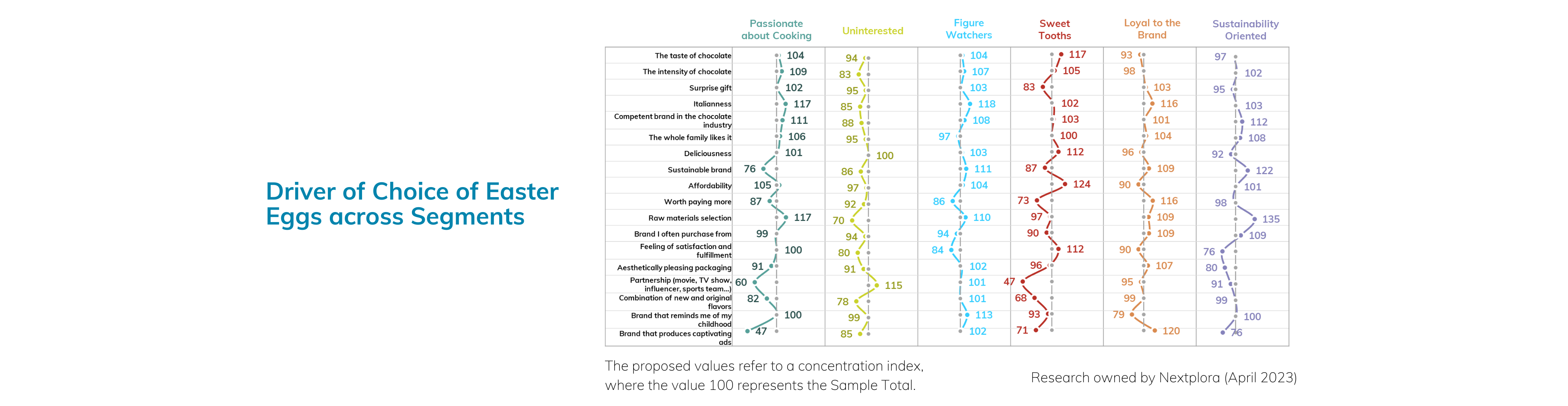
In the second graph, we delved into the drivers of choice using a segmentation analysis about consumer's attitude towards food and nutrition. We found that consumers who were "Uninterested" in food had the highest concentration index for partnerships with movies, TV shows, influencers, and sports teams. Their responses indicated a lower priority for "Intensity of chocolate" (83) and "Raw materials selection" (70).
In contrast, the "Passionate about cooking" segment prioritized "Italianness" (117), "Competence in the chocolate industry" (111), and "Raw materials selection" (117). Consumers who are passionate about cooking are likely to have a deeper understanding and appreciation of the quality and origin of ingredients, as well as the processes involved in creating a high-quality chocolate product. This group may also be more interested in the cultural significance of food and the history and traditions of Italian cuisine.
The "Sweet Tooth" segment emphasized "Taste of chocolate" (117) and "Affordability" (124). This group of consumers is less concerned with the health benefits or premium quality of the product, and instead seeks a delicious, affordable chocolate experience, while the "Figure Watchers" segment cared the least about "Feeling satisfied and fulfilled" (84) and placed greater importance on the "Italianness" of the brand (118).
Finally, the "Loyal to the brand" segment prioritized "Italianness" (116) and "Worthy paying more" (116) and showed a high index for "Captivating advertising" (120). Consumers in this segment may be loyal to the brand because it holds a special place in their hearts, perhaps due to positive memories or experiences associated with the brand. As a result, captivating advertising may serve to reinforce the emotional connection that consumers in this segment already have with the brand. Additionally, it's possible that consumers in this segment are more likely to be influenced by advertising in general, as they may be less price-sensitive and more brand-focused than other segments.
Lastly, the "Sustainability-oriented" segment emphasized "Raw materials selection" (135) and prioritized sustainable brands (122) and industry competence (112).
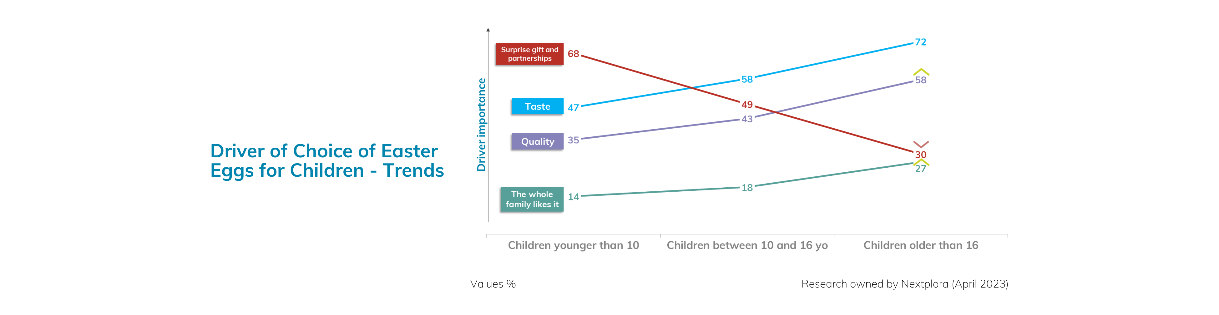
In the third and final graph, we explored how the drivers of choice varied based on the age of children in the household. We found that taste and chocolate quality became increasingly important as children grew older, while the surprise gift and partnerships became less relevant. As children enter their late teens, their taste preferences begin to converge with those of their parents, leading to greater shared enjoyment of Easter eggs within the family.
Italian consumers have distinct and diverse preferences when it comes to buying and consuming Easter eggs, with taste and "Italianness" emerging as the most significant drivers of choice across different segments. The research highlights the importance of understanding the unique needs and priorities of different consumer segments, including those with children and those without, as well as those with a passion for cooking or a focus on sustainability. Brands that can cater to these preferences and effectively communicate their value proposition are likely to succeed in the competitive Easter egg market. However, it's important to note that consumer behavior and preferences can be fluid and influenced by a variety of factors, including economic conditions, cultural shifts, and emerging trends. As such, ongoing research and adaptation are necessary to stay ahead of the curve and meet changing consumer needs.
Harnessing Color Psychology for Brand Success
They say a picture is worth a thousand words, but what about a color? In the world of branding, color can make or break a company's success. From the energizing red and yellow of McDonald's to the tranquil green of Whole Foods, the psychology of color plays a significant role in how consumers perceive a brand. In this article, we will discuss the impact that color has on consumer perception and examine how brands can use color to influence their target audience. So sit back, relax, and let's explore the fascinating world of color psychology in branding.
As consumers, we are often drawn to certain brands based on their visual appearance. The colors used in a brand's logo, website, packaging, and marketing materials can all have a significant impact on our perception of the brand. This is why color psychology plays such an important role in branding. By understanding the impact that color has on consumer perception, brands can use color to influence their target audience and create a strong brand identity.
The Impact of Color on Consumer Perception
The psychology of color is a complex and fascinating subject, and the way that color affects our emotions and behavior is still not fully understood. However, there are some general associations that people tend to make with certain colors, which can influence their perception of a brand.
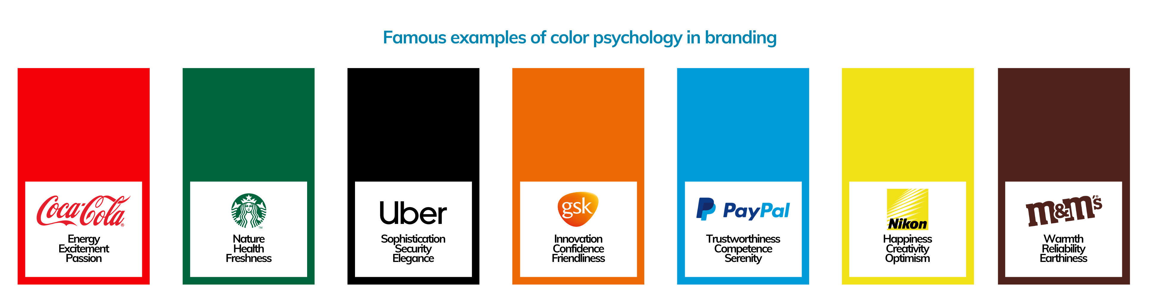
For example, blue is often associated with trustworthiness, competence, and professionalism. This is why many banks and financial institutions use blue in their branding. Red, on the other hand, is associated with energy, excitement, and passion, which is why it is often used by brands in the food and beverage industry.
Other colors have different connotations, such as green being associated with nature and health, yellow being associated with happiness and optimism, and purple being associated with luxury and sophistication. By using these colors strategically in their branding, brands can tap into these associations and influence how consumers perceive their products or services.
Successful Examples of Color Psychology in Branding
One of the most successful examples of color psychology in branding is the Coca-Cola brand. The iconic red and white color scheme of the Coca-Cola logo has become synonymous with the brand and is instantly recognizable all over the world. The use of red in the logo is no accident – red is a color that is associated with energy, excitement, and passion, which are all qualities that Coca-Cola wants to be associated with.
Another successful example of color psychology in branding is the green and white color scheme of the Starbucks logo. Green is a color that is associated with nature, health, and freshness, which are all qualities that are important to the Starbucks brand. The use of the color green in the logo also helps to reinforce the company's commitment to sustainability and environmentalism.
Unsuccessful Examples of Color Psychology in Branding
One example of a brand that failed to rebrand due to poor use of color psychology is the retailer JCPenney. JCPenney has a long history of rebranding behind it. First founded under the name The Golden Rule by James Cash Penney in 1902, it has changed logos 27 times since then until today, and the name itself has changed from The Golden Rule to JCPenney&Co to Penney's to JCPenney and finally back to Penney's- most recently in 2019.
In 2012, JCPenney underwent a rebranding effort that included changing its logo and store design. However, the company's use of a bright red color in its advertising and in-store signage was criticized as being too aggressive and not aligned with the brand's traditional values of quality and affordability. The color was also seen as being too similar to the color used by competitor Target.
More changes were also done to the original logo, including new graphical elements and the use of “jcp” rather than the full brand name. Ultimately, studies revealed that although 84% of consumers were familiar with JCPenney's original logo and 76% recognized the minor update in 2009, only 56% of people could associate JCPenney with the logo that was introduced in 2011.
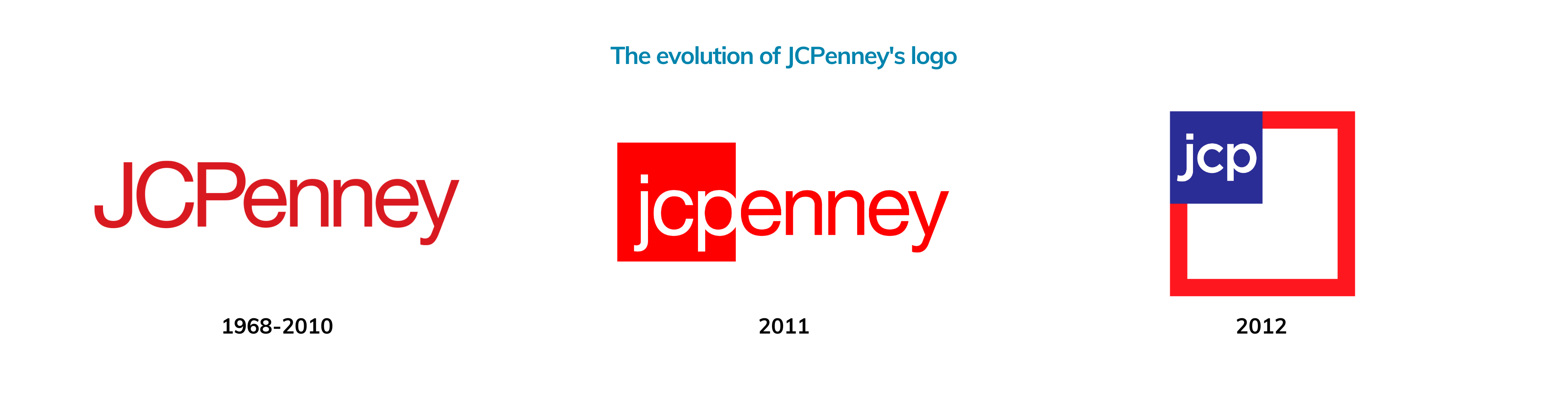
Alas, JCPenney had to backtrack and return to its previous branding elements, only minimally editing the font of the logo.
Choosing the right color
When it comes to choosing the right colors for a brand, there are several factors that should be taken into consideration:
- Target Audience: It is important to consider the target audience when choosing colors for a brand. Different age groups, genders, and cultures may have different color preferences and associations. For example, pink may be associated with femininity in Western cultures, but it may be associated with luck and prosperity in some Asian cultures.
- Brand Personality: The colors chosen for a brand should align with the brand's personality and values. For example, a luxury brand may opt for rich and elegant colors like gold or deep purple, while a playful and creative brand may opt for bright and bold colors like pink or orange.
- Industry Standards: It is important to consider the color schemes that are commonly used in a particular industry. For example, green is often used in the health and wellness industry, while blue is commonly used in the financial industry.
- Contrast and Legibility: The colors chosen for a brand should be easy to read and should provide enough contrast for legibility. This is especially important when it comes to choosing colors for logos and other visual elements.
- Emotion and Association: The colors chosen for a brand should evoke the desired emotion and association in the target audience. For example, blue may evoke a sense of calm and trust, while red may evoke a sense of excitement and urgency.
One thing you might have noticed before is how many popular social media platforms chose blue as the color of their user interface. This is a simple yet effective example of how blue as a color is an idea option for these platforms as it checks all the boxes.
Firstly, blue is a calming and soothing color, which can make users feel relaxed and comfortable while using the platform. This is important for social media networks, which aim to keep users engaged and on the platform for as long as possible.
Secondly, blue is a universally liked color, which means that it is unlikely to cause offense or negative reactions among users. This is important for social media networks, which aim to appeal to a wide range of users with different backgrounds and preferences.
Thirdly, blue is often associated with trust, professionalism, and reliability. This can be beneficial for social media networks, which need to establish a sense of trust and credibility with their users in order to encourage them to share personal information and engage with other users on the platform.
Finally, blue is a common color used in technology and digital products. This means that users may already associate the color blue with digital interfaces and find it familiar and easy to use.
In conclusion, color psychology plays a significant role in branding and has the power to influence how consumers perceive a brand. By strategically using colors that align with the brand's personality, target audience, and industry standards, brands can create a strong brand identity and differentiate themselves from competitors. However, it is important to choose colors carefully, taking into consideration factors such as contrast and legibility, and evoking the desired emotion and association in the target audience. As seen in the example of JCPenney, poor use of color psychology can lead to a failed rebranding effort. Ultimately, a brand's success in harnessing color psychology lies in the ability to create a visual language that speaks to its target audience and resonates with them on an emotional level.